Figma is one of those tools with everything you need to prototype, design, and hand off a new digital product.
Just like plugins, using base components in Figma can help designers so speed up their design workflows, and increase the efficiency of design processes.
In this article, we look at exploring:
- What are Figma components?
- What is a Figma components library?
- Why do designers use components?
- Advantages of using components
- How to add components in Figma
To understand the concept of the base components, you first need to know how components and instances work.
What are Figma components?
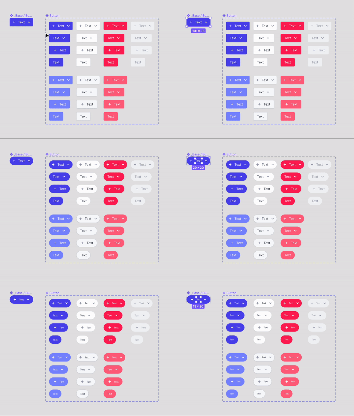
A component in Figma is an element that you can repeatedly use across your designs by managing consistency. Every time you define a component and its properties, you create a base component - otherwise called a master component. A base component can be a button, form, card, etc.
Instances are essentially copies of that base component. Changes made at the base component automatically apply to all the instances of that component. So when you have a bunch of instances tied to one component, and you intend to make changes to the structure of each one, then base components come in handy!
You can also create a single base component that all of your variations can inherit while making changes to individual versions - through overrides.
I think figuring out how to design an app or a website is similar to a game of Jenga. Each new page requires another block to be added to the tower. And like the game of Jenga, if you don't play your blocks carefully, your whole tower can come toppling down.
In a nutshell, base components are essential foundational blocks that you can use to establish consistency and commonality throughout your designs.

What is a Figma components library?
You can share components in Figma by publishing them. When you publish components in Figma, you create a components library that you can share with others. After publishing, your components can be used across all of your designs - you can drag instances in all your design files.
You'll receive a notification every time an update has been made available, but you'll be able to decide whether or not to accept it.
Why do designers use components?
Let’s say your component is a button.
When creating a button, you may have several properties like:
- type (primary, secondary, tertiary)
- states (active, hover, disabled)
All these instances are made by using a button base component instance and overriding properties. So if the shape, font, or spacing of all button instances needs to be changed, you can rapidly do it from the base component reducing the time spent on changing variants.
You can use overrides to change the property of each instance of the base component. When you override an instance, you change its properties without detaching it from the master component.
That way, you are able to make localized changes while allowing instances to keep inheriting updates from the master component.
Advantages of using components
There are a lot of reasons to use Figma base components. But here are our top 5:
1. Saves time on changes
You'll want to make some changes to your components every now and then. If you neglect to make recurring elements into components in the first place, you're going to waste a lot of time changing them individually.
In Figma, changing all instances at once is straightforward because all you have to do is change your main component.
2. Helps you maintain consistency throughout your design
When making a sandwich, the bread should be the same on both sides. What about when you're designing an app or website? You need to make sure that your design elements are consistent across all your screens.
Have you ever tried making a sandwich with two different types of bread? You could do it, but it just wouldn't look right—and it would be harder to make than if you used the same type of bread on both sides.
In Figma, when you change one component, all of the other instances of that component are automatically updated as well. You will no longer have to replace an element on every screen manually, rendering it vulnerable to inconsistency.
3. Helps you maintain the brand style guide
If your base components are set up based on the brand style guide, they'll help you maintain it throughout.
4. Makes it easier to collaborate with product developers
It's easier for product developers to use components if they're organized and built correctly, because the maintenance is done only on the main component.
5. Better organization for your design system
When working on a big project, getting lost with all the files is common. Components help you organize your project better by grouping files in the same space according to their function.
How to add components in Figma
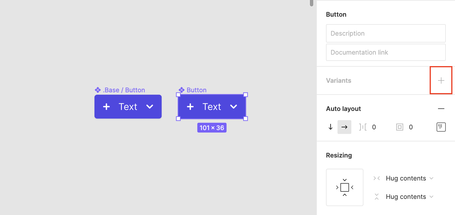
Step 1: Build a button component and name it (eg. _base/button). You can simply do this by pressing ⌥ + ⌘ + K or right-clicking on the element and selecting Create component.

Step 2: Duplicate that component and componentize it once again. Name this second component “Button”.

Step 3: Create different variants for the second component (primary, secondary) and each state (active, hover, disabled). To create different variants, go to the Variants section and click the + to create your first variant. By doing so, you'll have generated a new identical component, allowing you to make any visual modifications.


Here is a useful quick video if you would prefer to have a visual on how to add components in Figma.
Conclusion
To finish, here are some helpful considerations to have in mind:
- Base or master components are never used directly in the UI; instead, we use all the base component variants.
- To restrict base components from being published in the Figma library, you can add a prefix to the component's name such as period . or an underscore _ (eg. _base/button).
You've probably heard the adage: "It’s better to prepare than to repair" A related principle applies to Figma. The more you prepare your base components, the fewer headaches you'll have in the long run.
In this article, we've given you a tour of what base components are, how to make them, and how to use them to create a library of UI components that your team can easily use and update.
You now know how to streamline your design process with master components—but learning something and applying it aren't always the same thing.
So we're giving you a helping hand - if you want more information on how to improve your workflow, check out our Figma components tutorials.
Do you think these components are helpful to designers? Do they make a big difference in your design process? Let us know in the comments below.


