Imagine having your favorite characters and episodes right at your fingertips, not just on your iPhone but also on your Apple TV. In this article, we'll guide you through seamlessly transitioning your app from the palm of your hand to the comfort of your living room couch. Let's embark on this adventure to expand your "Rick and Morty" app to tvOS, providing an immersive experience for fans of all dimensions!
-> Check our SwiftUI List Tutorial
Starting point
We already have been working on a simple Rick&Morty app in iOS that has some features like listing the characters, adding them to favorites by using SwiftData for storage and listing the episodes names. The UI is straightforward; let's take a look at what we've accomplished so far.
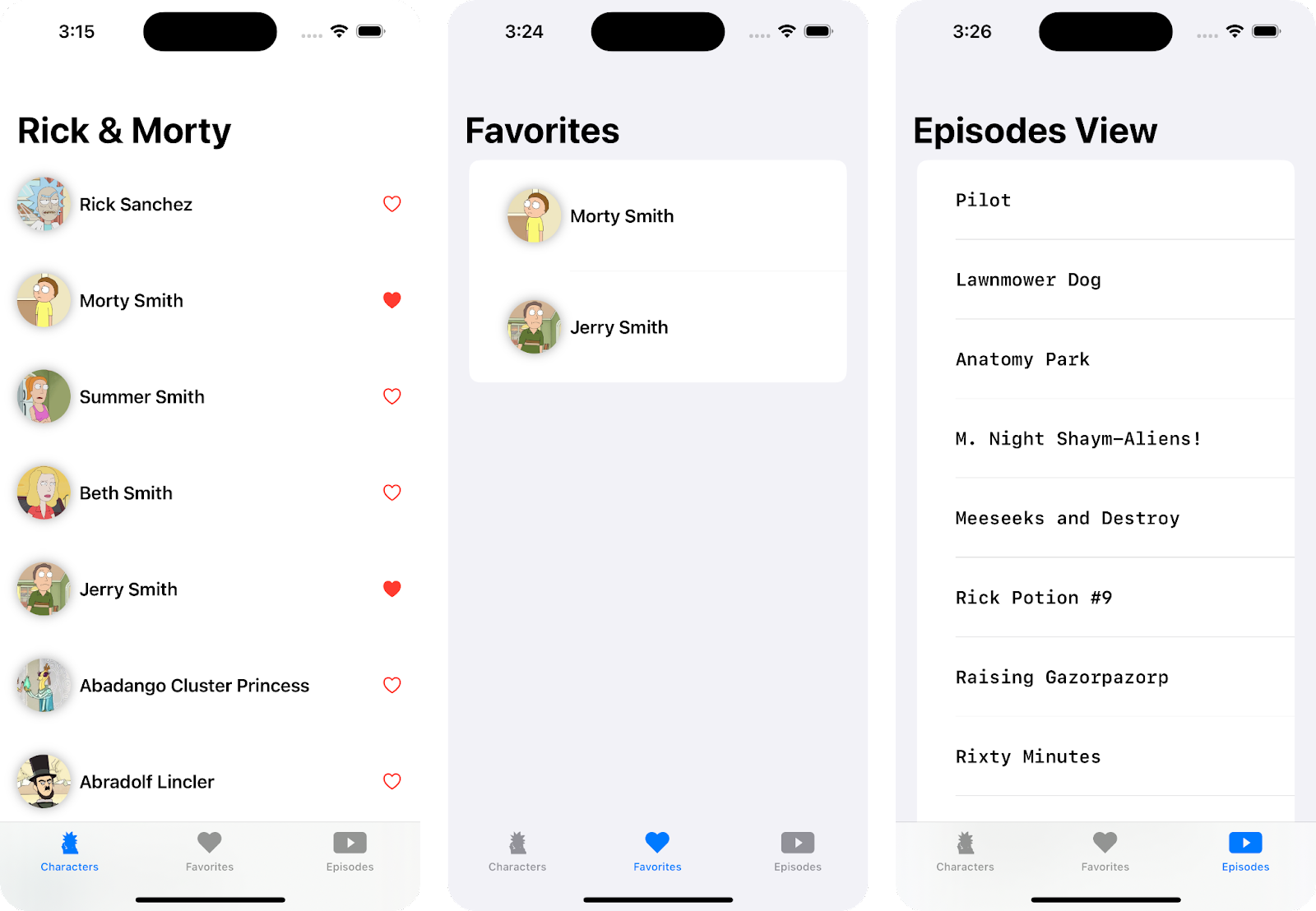
As you can see, the UI is very simple and intuitive. This format is perfect for focusing on the important topic at hand, which is the addition of tvOS.
The idea is to reuse the same UI components that we are using on iOS. Since we are using SwiftUI, some of the advantages is that it allows us to build cross-platform applications for iOS, iPadOS, watchOS, and tvOS. This means we don't have to create different components for each platform, but rather make small modifications to the existing ones.
so let's continue with the important topic here!.
-> Check our SwiftUI Button Tutorial
-> Check our SwiftUI GeometryReader Tutorial
Adding tvOS to the project
To add tvOS to your existing SwiftUI project, follow these steps:
- In the Project settings, click the “+” button.
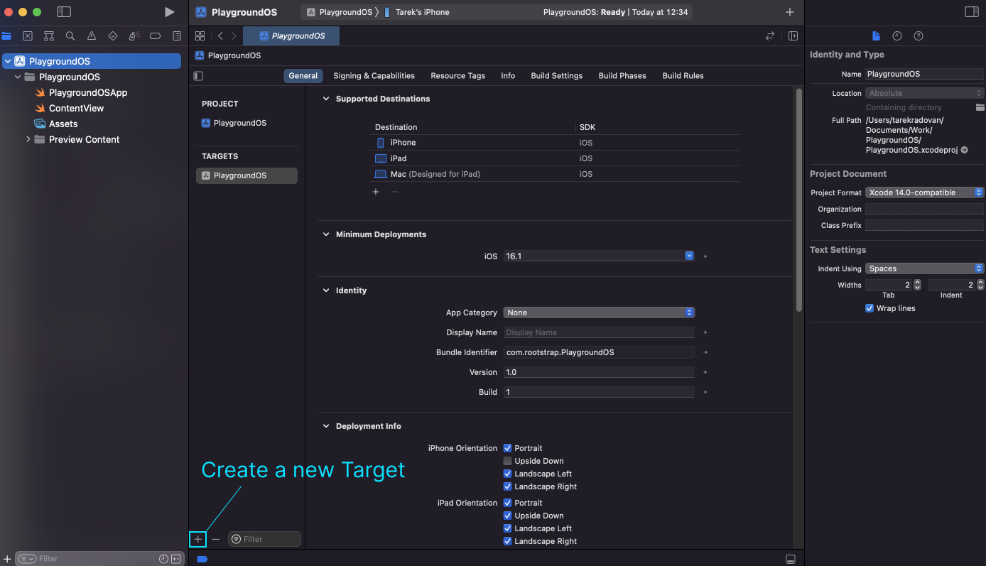
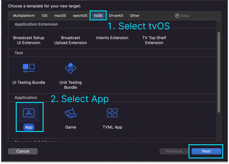
- Select tvOS, then App :
- I recommend you to write the same name of the project and specify that it is a tvOS product by adding "tvOS" at the end of the name.
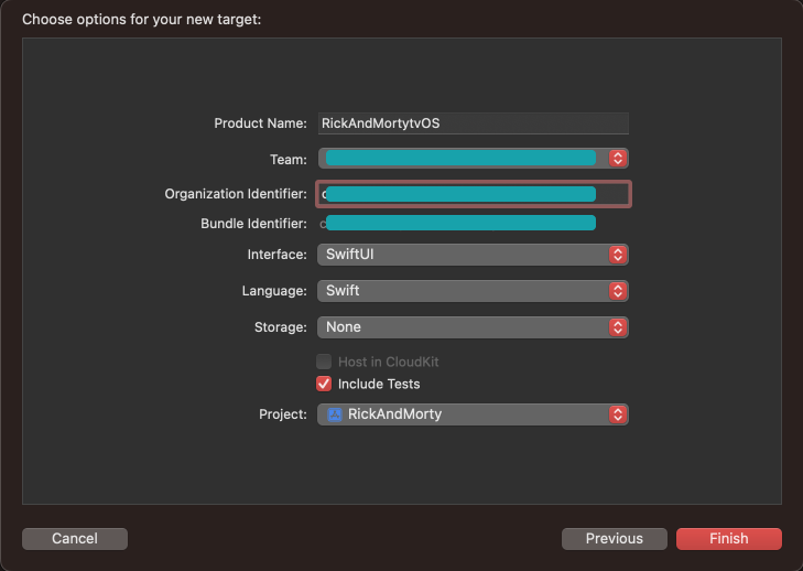
Now we have the tvOS integrated next to our iOS project.
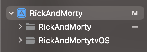
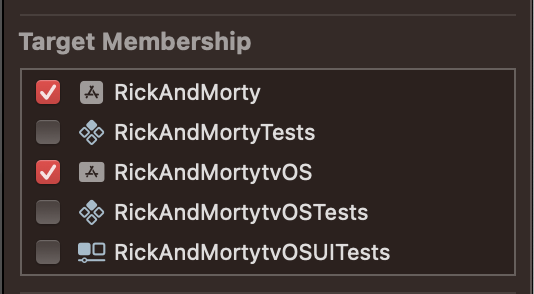
However, we are not finished yet. In order to use the same files that we have implemented on iOS in tvOS, we need to mark the tvOS target as available in each of those files. This can be done by going to the "file inspector" of the file and checking the tvOS option. The result will be something like this:
UI adaptability
As we mentioned before, Since we are working with SwiftUI, It allows us to reuse the same UI for multiple platforms. BUT!!.. There are some important points that we have to consider to keep a good UX in both platforms.
While the same views can generally be used in both platforms without any issues, there may be differences in the UI/UX. This is because the dimensions and interaction methods of each device are distinct, and the sizes or styles of certain components may appear suitable on one platform but not on the other.
Using the same View for both Platforms
In the following code we can see the HomeView
CODE: https://gist.github.com/tarruk/5a7d297250d72ad828b68b40ec40ce23.js?file=HomeView.swift
While the TabView is being rendered very well on both platforms and the blue color used for the icons fits nicely with iOS, it doesn't seem to be as suitable for the tvOS UI.

To achieve this, a minor adjustment in our TabView is necessary. By determining the active platform, we can dynamically select the most suitable color for our UI. This involves integrating a conditional statement into the accent color code line.
CODE: https://gist.github.com/tarruk/3b9d7221f0a6637e95c2ca1168f62d55.js?file=HomeView.swift

And that was an example of how we can use the same view but make small changes to fit it well on both platforms. Of course, you can customize it to better suit your needs, but for the purpose of this example, let's say we are done.
Using separate Views for each platform
Here we can see the code that represents the content of the CharactersView.
CODE: https://gist.github.com/tarruk/42dc306c60b1b490e3ca75b0b9ffa40f.js?file=CharactersView.swift
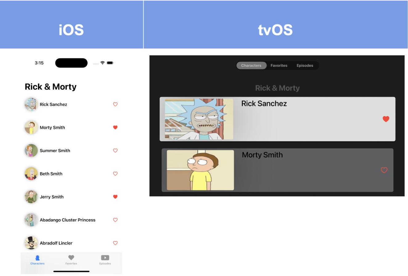
If we currently run the app as it is in both platforms, the actual UI will jump as something like this:
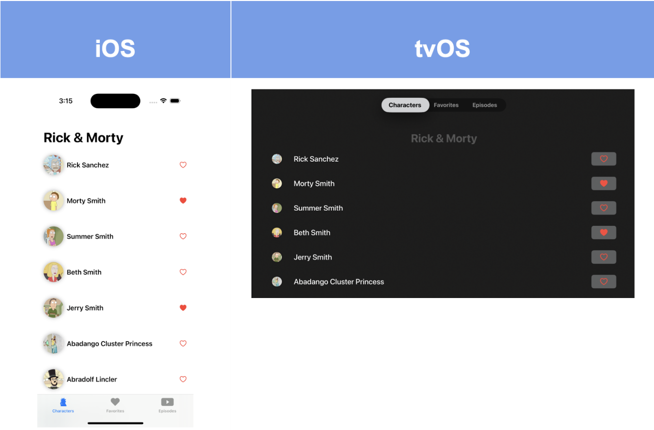
We can see that while the current layout in iOS may not have the most beautiful UI, it is still acceptable and readable. However, in tvOS, on the other hand, the layout is very poor and does not align with the platform's feedback or the intended user experience.
In this case we can use completely different Character views depending of the platform
So, we create a special CharacterViewTV that is specifically marked as a tvOS target.
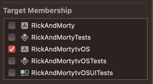
Now we can make the decision of which view to use. The code in the CharactersView will result in something like this:
CODE: https://gist.github.com/tarruk/b18f1ff13ac8902ab3fcd4c291260066.js?file=CharactersView.swift
After implementing both views for each environment, we can appreciate that, while it may not be the most beautiful UI, the final result is much more suitable for each platform.
What about functionality?, something changes?
In tvOS, ScrollView for example, can be tricky to work with if their content doesn't include focusable elements. While it's true that focusable elements like buttons work seamlessly with the tvOS focus engine and can naturally receive user input for scrolling, it doesn't mean that non-button components can't be scrollable.
So let me give you some tips to use the same UI in both platforms with just small changes
In the CharactersView we can see that each item of the list has a heart-shaped button that allow us to add or remove the character to favorites. This means that each character view will be focused when tvOS is running , therefore, that list will be automatically scrollable for both platforms, iOS and tvOS without making any changes on any view.
The EpisodesView is different because it only renders a Text component to display the title of each episode. By default, this text is not focusable.
CODE: https://gist.github.com/tarruk/2e7de31c55ddfe4f3c1d954ee79587b1.js?file=EpisodesView.swift
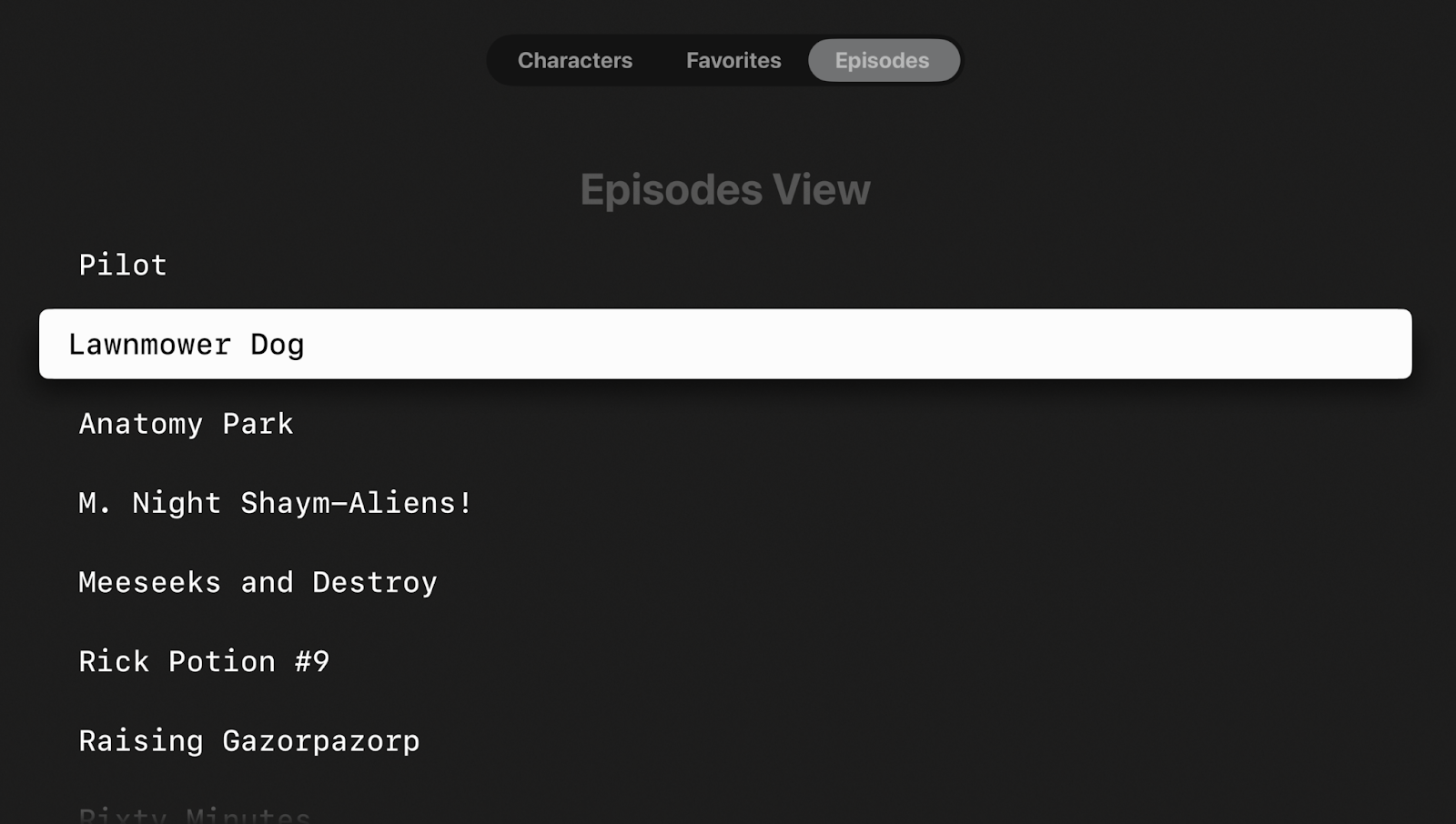
So, this results in a non-scrolling ScrollView in tvOS 😅. One potential solution to fix this issue is to enclose the text within a button when the platform is tvOS.
CODE: https://gist.github.com/tarruk/0f45043b422475e0d372a2e549a9c88f.js?file=EpisodesView.swift
The resulting view will be something like this:
Adding tvOS expands your app's reach, giving a rich experience to a wider audience, and while we have covered aspects like UI adaptations and UI reusability in this discussion, it's important to note that there are additional considerations to explore for a successful tvOS integration. Each project may have unique requirements, but in general, the most important keys that we can take into account would be:
- Adaptability: Considering the distinct needs of different platforms is crucial for creating better UX. For instance, focus management is vital for a smooth tvOS experience but holds less significance for iOS.
- Reusability: Emphasizing the reuse of UI components not only enhances project efficiency and productivity but also guarantees a uniform design across various platforms, ensuring a consistent UI.
- Navigation and input: Rethink navigation patterns. tvOS uses a different paradigm compared to touch-based iOS devices. Utilize focus-driven navigation.
- Performance: Optimize performance for the larger screen. Rendering complex UI elements can be more resource-intensive on TV.
Remember, while these points cover essential UI adaptations and reusability aspects, each project might present unique challenges. Thorough evaluation, adaptation, and testing are vital to ensure a successful tvOS integration.


