This solution, I feel, is the best possible option. Why? Because you don’t need to alter or modify the icons you have, but rather just wrap them in a specific scenario.
This saves a lot of time and avoids repetition, which other techniques lack. For example, matching all the layer names or ensuring the same number of layers for each icon. These approaches can be quite cumbersome.
Common Scenario

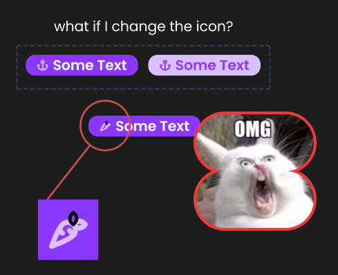
Have you ever encountered an issue where you have a beautiful button, navigation bar, or other element that consumes your icons, and those icons have a color applied to them? Then, when you decide to change the icon for other instances, the new icon appears to have chickenpox. Suddenly, the icon preserves the original color for some parts and changes the overridden color for others.
Why does this happen?

This is actually due to the different structures that each icon has. This is a common issue, even on the best icon sets.
Each icon has its own structure. For example, the arrow icon may have a group with two layers of vectors, while the three-dots menu icon may only have one vector layer inside.
This is where the problem arises. Figma tries to understand the structure, and when it finds that the structures differ, it has to decide how to apply the overrides or changes that you layered on top of them. For example, if you change the color of an icon on a button component during the hover state, this is an override (read more about overrides in this article). Figma takes your icon component and overrides it with the color change, which works great for the first instance. However, if you decide to swap this icon on a different button instance, Figma doesn’t know what to do because it is trying to apply the color again to a different icon structure.
Union is key

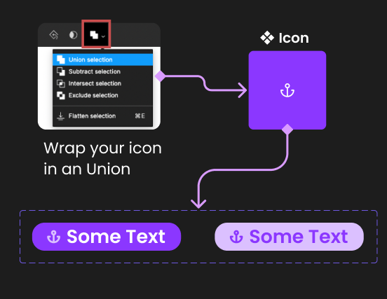
The technique behind this idea involves wrapping the icon with a union (see image ☝️). Why? Because we need to separate the logic of color application from the icons themselves, as their different layer structures can cause issues.
In essence, if you wrap your icon structure and perform a union, this union will now be responsible for color changes. This means that every time you decide to change color, the change will happen at this level only, which will manage what occurs and how the color is applied to the icon inside.
Since the union is already performing complex logic to merge things inside, we luckily have the math to solve the rendering issues that we previously had.
And… voila!!!

In depth dive

Decompressing a bit more the idea I defined above, let’s see together the structure for this “hack”.
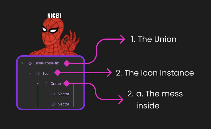
Breaking down the levels or layer groups, we have:
- Your Wrapper, where the union is being applied
- The icon instance component
- This icon inside has all the rubbish an icon could have, groups, vectors, etc, we don’t care about that, as long as we perform correctly the Union.
I recommend creating a separate structure for applying this hack to all of your icons. Below, I’ll explain why.
Component recommendation
In most cases, you’ll have a set of independent icons that are components. If this is your situation, I highly recommend identifying the repetition pattern and creating a Union in a single place. This will save you time.
You could also perform the Union on each icon individually, but I advocate for designers being the front line of coding decisions. We create components and real code, defining guidelines and identifying patterns.
Here, the repetition pattern is clear. We’re performing the same action across multiple icons. Let’s migrate that to a separate component that takes care of it. This component will receive the icon instance as a child and perform the union on top of it.
Create a Base Icon

We are creating a base Icon component that will be used throughout our designs, buttons, navigations, and more.
This ❖ Icon will serve two purposes:
- Apply the union on top of the Icon instance
- Allow you to swap the Icon Type with an Instance Swap Property
Important!
When updating the color of your instances, do so at the Union level, not inside, to avoid encountering the same issue.
Summary
Hopefully, my explanation makes sense and this tip helps you. It certainly helped me since I struggled with the same error repeatedly. I spent so many hours coloring independent strokes of an icon to fix it. I cannot stress enough how happy I am to have this trick up my sleeve ♣️. Hopefully, now it’s up your sleeve too, and you can use it at your discretion.
Figma Example
For those who wish to understand a bit better, or just copy paste and see the structure running, I just created a file on Figma, hope it helps to clarify all the words here. :)
I hope you found this information useful, and I welcome any challenges to my decisions with better solutions in the near future. 👋🏻


.jpg)