This article tries to provide a blend of philosophical decision-making and pro tips for using and structuring components in the most effective way possible. It combines components in the programming world with the features that Figma offers.
This is not intended to be a criticism of Figma. Quite the opposite, it takes an open-minded perspective and embraces as many tools as possible that Figma provides. At the same time, it encourages us to use our critical thinking skills to question whether these are the right decisions, where they might lead, and whether it makes sense to take the leap or continue working the way we were before all the new feature introductions.
What I call a Master Component
It’s a component that we create to use as base for other components.
Usually they are used to store big structural changes, so that you can manage small variations on these other new components.
For example: Imagine I want to create a Button, and I know this component is gonna have 3 sizes, and different styles, etc (as image below with possible Props.)

You can start with a .🔒master / Button component (check naming conventions here) and create a new component by grabbing a copy (instance) of it. This will be your true Button Component, where you can create different small “Variations” (hence the name Variants in Figma) to create different sizes, styles, etc.
By relying on the master component, you can easily make changes to typography or guidelines. For example, if you need to switch your buttons from rounded to square, this is where you can do it.
Difference between Master & Nested Components
We have already defined the Master component, but I want to clarify our terminology before we move forward.
The reason for this is that it can easily cause confusion, as a ❖Master Component is, in its instantiated nature, also a Nested Component 😦 hehehe.
Nested components, as the name suggests, are any other components placed inside another component. For example, if I had an Icon component and I created a Button, and placed an instance of this icon inside the button, that would mean this Icon instance is a Nested Component.
Why am I writing this?
First, I want to see if others are noticing the same structural changes happening with Figma. By changes, I mean how Figma is gradually introducing features such as selecting similar layers on a Variant and not being able to select layers inside other instances.
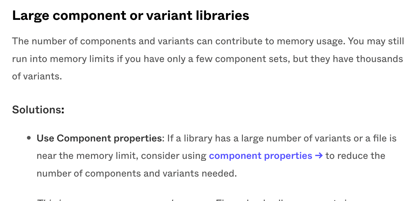
Second, if you encounter memory issues, one of Figma’s top recommendations is to “use fewer nested components.” This advice is in line with Figma’s new approach, which aims to reduce the use of master items.
Last but not least, their documentation doesn’t promote or provide any explanations about master components. In fact, it’s quite the opposite. You can browse their guide to components in Figma here.
Why I think Figma is doing this?
To make structure easier.
Less nesting, less complexity, are we right? Which is pretty basic on its essence.
It leads to more adoption of the tool and practices around it, but also simplifies the learning curve. Imagine if they gave you talks and explain broadly how to create master components to centralize general changes… I consider myself an avid user of Figma, and sometimes I also consider the whole Master Component process a bit complicated.
To mitigate errors.
Think this one from the Figma development perspective. Imagine all the logic happening when we start nesting, and now imagine tracking down all the “Overrides” we do when creating variants of the master component… What would be your conclusion?
This is way more prone to errors than just managing everything within the variants.
Go back in time a bit, and try to remember on your years of using Figma, how many times you encounter errors of overrides not propagating, components not responding to changes, etc? Quite a few times right? Do you recall when that started to happen more often? In my case is super clear, all the headaches started when I became an Ace of Figma and started hacking my way down to complex components and properties.
To Solve memory issues.


As you see in the image above, Figma itself promotes small number of variants and simple components.
I had several struggles with this one! ☝️ Let me tell you a small story.
It all started when I created a robust system using Master Components. I had a big project where we were building a platform for managing franchises, companies, and stores, alongside staff, people, purchases, etc. Essentially, a large project.
I did everything right, as my old habits were telling me to. I created separate libraries for styles, separate files for common and specific components, and different UI files that consumed these sets of components. I even started creating template pages, since it made a lot of sense. We had a lot of screens that shared almost the same UI, with only minor differences.
However, this is where the nightmare began. The infamous Memory Sign appeared, and the team and I did everything we could to reduce memory usage. I even had several conversations with support, and the issues were all around complex components getting bugged, and complexity being too high.
Imagine what happened when we created pages… things became worse, we now had pages with nested components, master components, and different states.
A few months later, Figma launched Properties, which I loved the first time I saw them. It was a great way to get closer to the programming world and avoid repetition. However, a few weeks later, the error returned.
The solution was to simplify our project and remove page templates. We had a complex set of components and a robust project, but the truth was that we didn’t have that many screens. It wasn’t a crazy project, it was perfectly organized and optimized for productivity and using templates.
After that scenario, I decided to move away from my standard working process and be smarter about creating my components and using props to the fullest extent.
Fun fact: I never had the same error again!
If you can’t beat them… 😅

In my case, the phrase “if you can’t beat them, beat them” fails 😛. I have joined Figma and trust their decisions, or at least follow these rules, as they currently produce better outcomes for both parties.
I don’t use Master components any more.

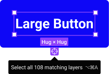
I became a fan of the “Select Matching Layers” feature (⌥⌘A). This feature allows you to do the same thing as editing a master component. By selecting all of the text elements with the same name (under the same folder structure, of course), I can apply any general changes I need without leaving my main button component.
I do use nested components.

As I explained earlier, when discussing the differences between master and nested components, the latter are undoubtedly useful. You can’t create complex components like navigations, cards, or others without building up to a certain point.
For instance, an app with a bottom navigation would have two nested components: the navigation item itself, and possibly the icon component within it (check image reference above).
Became best apprentice of properties
To prevent past failures with memory and reduce repetition in my processes, I delved deep into the world of properties. Through multiple tests, I gained a thorough understanding of how props work and how to leverage them to my advantage.
With repeated use comes an understanding of patterns and weak points. For example, when using show/hide properties for an icon and also setting up an instance swap property for it (or anything inside it), that property will appear or disappear from the panel depending on the show/hide toggle.
This is where the magic happens, and you begin to notice that the order of your props matters and that Figma lacks visual aids to help you understand which props are children of others.
I found those gaps and tried to fix them…
More in depth on this to come on the next article 😉. Stay tuned! I will explain how to leverage the properties to your advantage by naming them, making nested properties more intuitive, triggering multiple elements with the same property, and setting preferred values. (Exited! 😃)
My recommendation
Use a hybrid construction approach and play smart.

Basic rule: Use the power of variants and avoid creating a master for simple components. Apply “Select Multiple” for editing these, like buttons, avatars, basic input, etc (you can follow atomic Approach), and use with your discretion nesting components.
For example buttons, these rarely are gonna have other complex components inside, so I would avoid to have a master component for them. And yes, inside these could have a Left-icon or other small components.
Why I say this.
I know it can be scary, but hear me out. Here’s what you get:
- Same Tradeoff
You can select multiple instances of the text or any other element and make changes as if you were on a single centralized master component. - Reduced Complexity
This approach simplifies Figma by eliminating the need to jump from component to component to reach the editable option. - Simplified Documentation
You don’t need to document twice or reference the master components to the copies, which can help reduce Figma file size. - Easier Adoption
Fewer components mean less cognitive load for others to understand, making your library easier to digest.
Negative POV
- Prone to error
You could feel tempted to forget that you are creating a single component and perform changes on variants making your component (and Figma) loose track of the matching layers, so we can say that is prone to errors if your’e not careful enough. Is something easy to solve, you can check tips below - Performing structural Changes
Doing big changes requires for you to copy / paste onto the other variants, for example if you suddenly realized you need an extra wrapper between an Icon and a text, your gonna have to create that on the first copy and then copy / Pase on the rest of the variants, but hey! don’t worry, there’s an easy way to do this.
Tip: How to apply a change to other variants
- Perform the change on one of the variants.
- Copy the structure you want to duplicate with ⌘C.
- Go to another variant and select the item that needs to be replaced.
- Hit ⌥⌘A. Our select-multiple friend appears and voila! You now have all the elements selected on all the other variants (exclude anything if needed with Shift + click).
- Hit ⌘⇧R (command + shift + R). This will grab all your selected items and replace them with the copied structure.
Looking Ahead
I’ll continue to frown and try to figure out this equation until Figma adds the ability to select elements within an instance that’s inside another component. Don’t get me wrong, I am just a little skeptical about this change, as it deviates from the programming paradigm that has been the norm for the vast majority of time.
I am used to having a master component that can be reused and built upon, saving time and effort. This new approach is different and could potentially lead to errors if not executed carefully.
However, it also simplifies file complexity and documentation, making it easier to explain to other designers and developers. It helps avoid getting lost in complex nested master components.
I believe that Figma’s properties, Auto Layout, and other cool features will lead to a brighter future. However, until these features are polished, I remain skeptical. Auto Layout still has strange resets and bugs, and variants do not let you select the same elements if they are nested inside an instance.
Imagine if all that was solved tomorrow… 🪄 ✨✨✨
I hope you found this information useful, and I welcome any challenges to my decisions with better solutions in the near future. 👋🏻


.jpeg)

